elemtilas
44 Watchers258 Deviations
15.8K
Pageviews


RyanSun60
Omniprophet
WolfAssassin754
Spiderspook
Touch-Not-This-Cat
rolandsrifles
Lilitylaylali
GlyphBellchime
k1234567890y
sp3ctra8
PueyMcCleary
Rem-Art0
Collection
Favourites

Dralamy
SkyHunter2009
smoustart
KateThePugGirl
CathM
MuZzling
k1234567890y
prettydragoon
Nameless-shade
ArtSpacious
Klawddie
Sanskarans
travisJhanson
original-worlds
WingedGirls


elemtilas is not a Group Admin yet
Groups they admin or create will appear here
Artist // Hobbyist // Literature
- United States
- Deviant for 8 years
Project Comment Critiques -- 2019
0 min read
4.JAN.2019
Heyo from Project Comment!
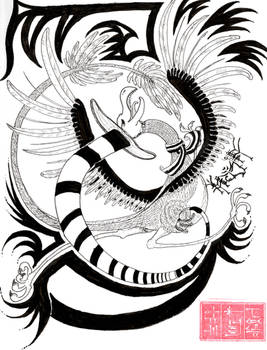
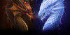
That's a big sparrow!
So, this looks like a gunship of some kind. I see the turret gun up on top, a large forward facing cannon and that kind of spear-like gun down below. It appears to be a small-to-mid-sized vessel, so I'm guessing fairly manoeuverable. It looks like there are some windows in that gun turret and also in the forward section amidship. I don't see any smaller canons or anti-fighter gun turrets. Looks fairly imposing. I certainly wouldn't want to be in front of this thing when it's shooting!
Very well drawn, and your line work is quite good. I do notice some areas (very faint lines
Join the community to add your comment. Already a deviant? Log In
Project Comment Critiques -- 2018
0 min read
14 June 2018:
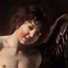
Winged folk are the best! (Mine are Daine, and they don't wear shoes as a matter of course. This girl will get used to the discalced life eventually!)
I like the pose and especially her facial expression! I don't know how to fix it, but the execution of her pose looks a little off: her legs seem to be sticking out at odd angles and appear two dimensional. The overall style, I'm sure you'd agree, is one of simple strokes and less detail. (Not a complaint or criticism!) If you ever decide on a more detailed version (and I hope you do!), her feathers could certainly do with some detailing: veins, not so smooth edges, differences
Join the community to add your comment. Already a deviant? Log In
Profile Comments 158
Join the community to add your comment. Already a deviant? Log In

Thank you so much the Watch! We appreciate it a lot, hope you enjoy reading our comic 

Thank you so much for the fav
thank you so much for the fav! <3
Thanks for the fav
You're very welcome!